Avia dashboard overview
A tour of every dashboard section: KPIs, demographics, heatmap, forecast, and daily table.
The Avia dashboard is your central view of store performance. It brings together foot traffic, sales, and operational data into a single screen.
Key metrics at a glance
At the top of the dashboard you'll see your primary KPIs for the selected date range:
You can toggle between Unique Visitors and Total Traffic at the top. This switch updates all metrics across the entire dashboard.
Info: Why deduplication matters: a staff member who walks in and out 10 times counts as 1 unique visitor but 10 in total traffic. Unique Visitors gives you a true read on customer conversion and dwell time.
Info: When your data appears. During opening hours, you can see Total Traffic, which refreshes approximately every hour from live data the device sends. Use it to get a glance at what's happening in your store during the day, but treat it as approximate, since the live figure can differ from the final count. Unique Visitors is not available during the day. After the store's closing hours, or the next day, the device sends its full data for the day, giving you the accurate Total Traffic and Unique Visitors. For reliable daily numbers, rely on the data available after closing.
Gross or net sales
You can choose whether the dashboard shows gross sales or net sales:
Gross sales: total sales before discounts and returns
Net sales: sales after discounts and returns are subtracted
To switch, go to Settings → Preferences and choose Gross sales or Net sales. All sales-based numbers update to match, including Average Order Value, Revenue per Visitor, and the daily performance table.

Visitor demographics
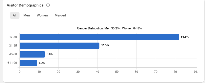
Below the KPIs, you'll see a breakdown of visitors by gender and age group. This updates based on your selected date range and filters.
Traffic heatmap
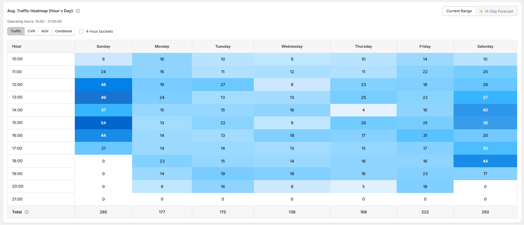
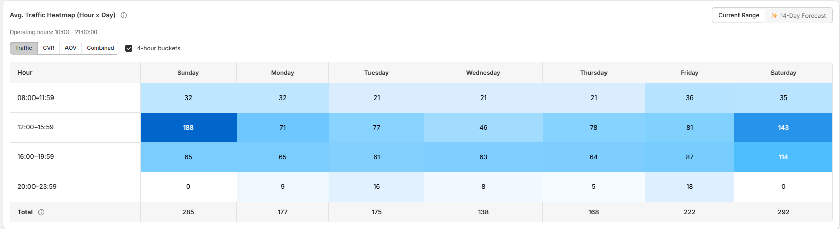
A grid showing visitor volume by hour of day and day of week. Switch between:
Hourly view: precise traffic by hour
4-hour bucket view: aligns with typical shift schedules (morning, afternoon, evening)
You can also switch the heatmap to show Conversion Rate or AOV by time slot, or a Combined View that overlays all three, useful for spotting high-traffic periods with low conversion, which often signals understaffing.
Traffic forecast
The 7-day forward forecast appears alongside the heatmap. It uses a linear regression model trained on your store's own history and requires at least 2 weeks of data to activate.
Daily performance table
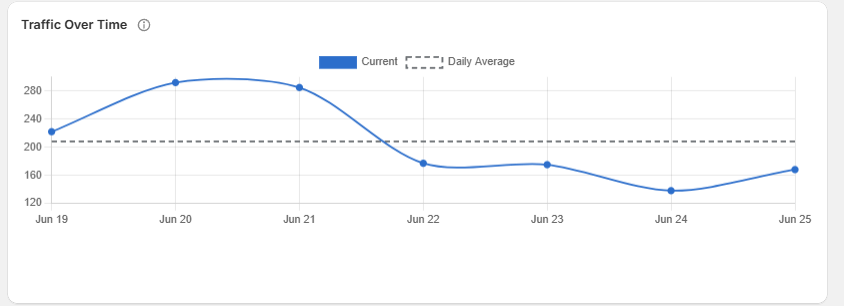
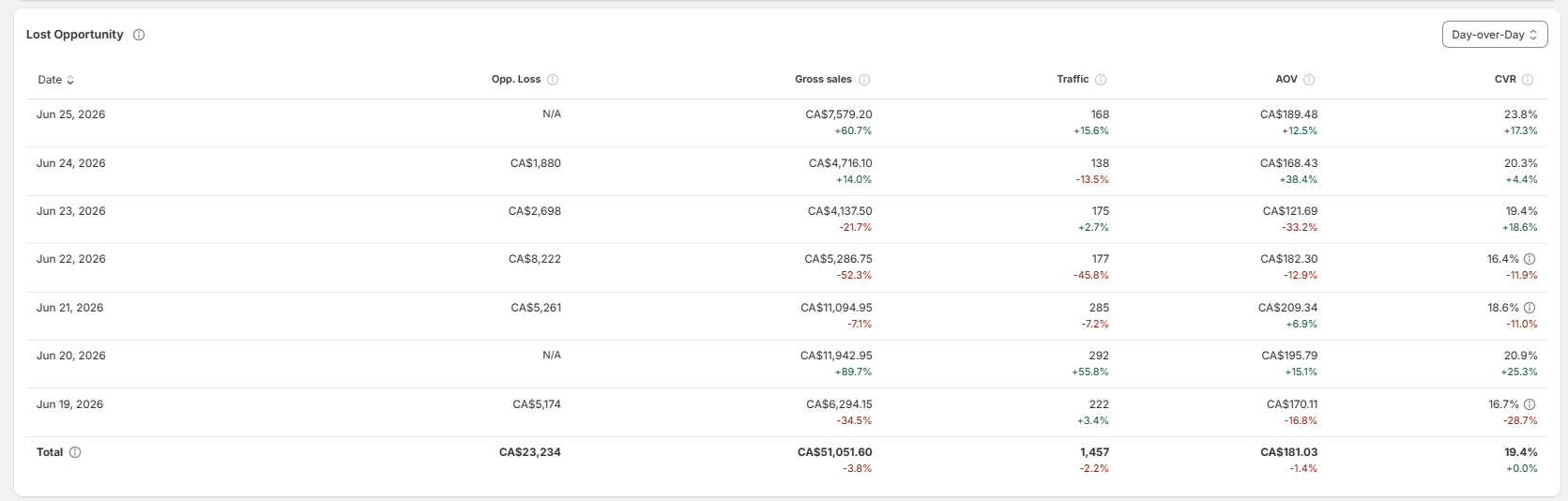
At the bottom, a day-by-day breakdown using the sales decomposition formula: Sales = Traffic × Conversion Rate × AOV. Each row shows Sales (gross or net, depending on your preference), Unique Visitors, Conversion Rate, and AOV for that day. When sales drop, this table tells you which lever changed: traffic, conversion, or basket size.
Store comparison
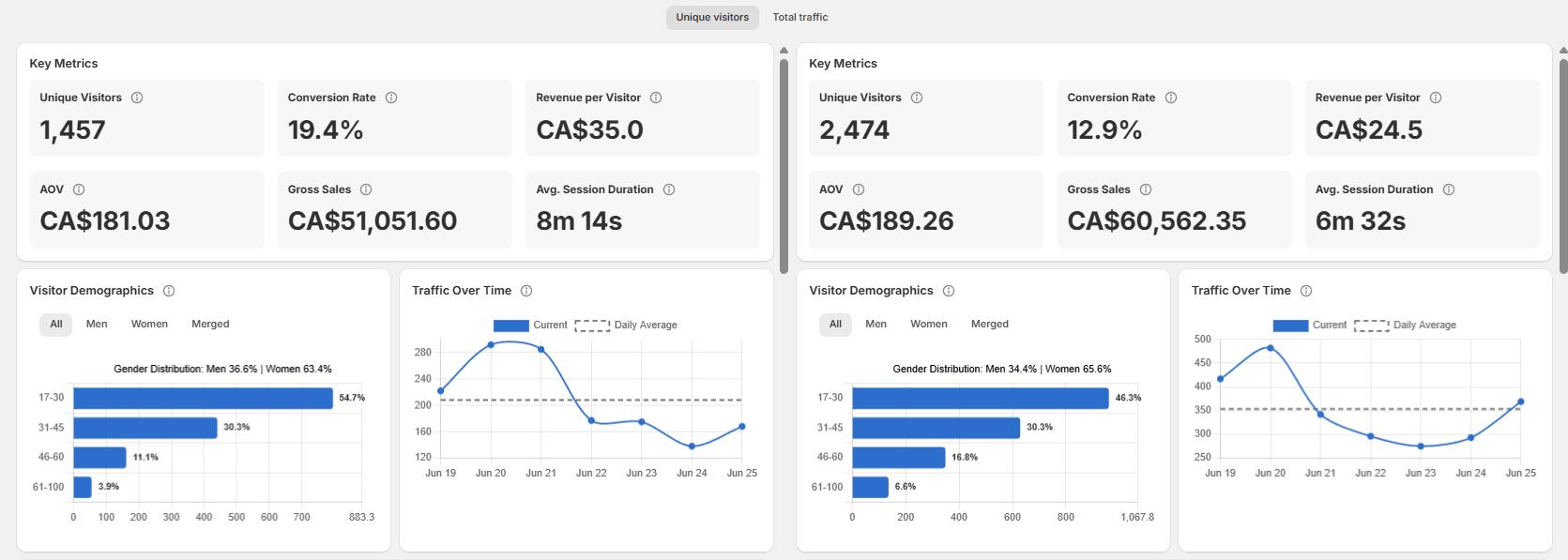
Click Compare to view two stores (or store groups) side by side across all metrics. Useful for benchmarking locations or regional groups.
Filters and date ranges
Use the date picker, store selector and entrance selector at the top to focus on a specific period, location or entrance. See Using date ranges & filters for full details.
Related articles
Need help?
If the dashboard data does not look correct after checking the selected store, date range, and store opening hours, contact Avia support at avia.support@retailogists.com and include:
Store name
Selected date range
A screenshot of the dashboard
Which metric or section looks incorrect
Was this helpful?
Still need help? Ask the team